What Is a Widow or Orphan in Typography?
Key Concepts in Text Layout
In the world of typography, terms like "widow" and "orphan" are not as somber as they might sound. Instead, they refer to common issues that can affect the aesthetic and readability of a text. This article explores the meaning of widows and orphans in typography, why they matter, and how to avoid them in your document layouts.

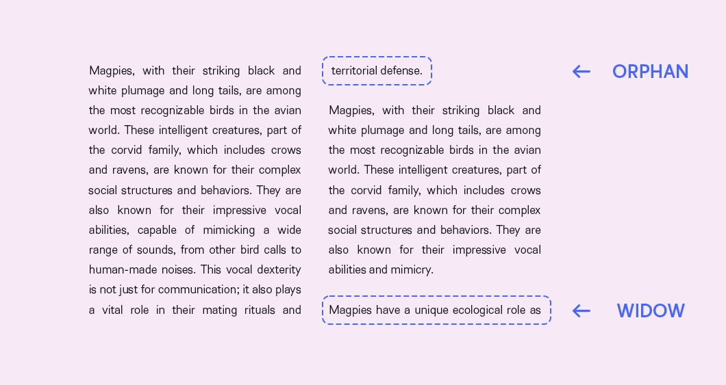
Example of widows and orphans in text.
Understanding Widows in Typography
A "widow" in typography is a term used to describe a single word or short line at the end of a paragraph that appears alone at the top of a page or column. This isolated line can disrupt the reader's flow and create an unbalanced look on the page. For example, imagine reading a paragraph and finding just one word or a short phrase on the following page. It feels disjointed and can detract from the overall reading experience.
Why Do Widows Matter?
1) Aesthetic Appeal: A widow can make a page look uneven or poorly designed.
2) Reading Flow: It can interrupt the natural flow of reading, causing a slight but noticeable disruption for the reader.
3) Professionalism: In professional publications, avoiding widows reflects attention to detail and a high standard of design.
Understanding Orphans in Typography
An "orphan" is similar to a widow but appears at the bottom of a page or column. It is a single word or short line that begins a paragraph but is separated from the rest of the text, which continues on the next page or column. Orphans can create a sense of incompleteness and visually disrupt the layout of the text.
Why Do Orphans Matter?
1) Visual Harmony: Orphans can break the harmony of a page, leaving too much white space or creating an awkward division of text.
2) Reader Engagement: They can negatively impact reader engagement, as readers might find the text less appealing or harder to follow.
3) Consistency: Maintaining a consistent layout without orphans shows a commitment to quality and consistency in document design.
How to Avoid Widows and Orphans
Here are some effective strategies:
1) Adjust Line Breaks: Manually adjusting line breaks and paragraph spacing can help keep paragraphs together.
2) Modify Text: Slightly rewording sentences can change the text flow to avoid widows and orphans.
3) Flexible Margins and Spacing: Allowing some flexibility in margins and spacing can accommodate longer lines or paragraphs.
4) Use Typography Software: Most modern word processors and design software have settings to automatically avoid widows and orphans.
Conclusion
Widows and orphans are more than just typographic terms; they're crucial elements of design that impact the readability and aesthetic of a document. By understanding and addressing these issues, designers and writers can create more engaging and visually appealing content. Whether you are a professional designer or someone who regularly works with text, keeping an eye out for widows and orphans is an essential part of producing high-quality work. Remember, good typography is not just about what you say, but also how it looks on the page.


