Make your designs unforgettable with our signature fonts
What Is Tracking In Typography?
A Comprehensive Guide to Letter Spacing
In the world of typography, every detail matters. While kerning adjusts the space between *individual* letter pairs, tracking, also known as letter-spacing, is another critical aspect that significantly impacts the readability and visual appeal of your text. Understanding tracking and how to use it effectively can elevate your designs, making them more professional and polished.
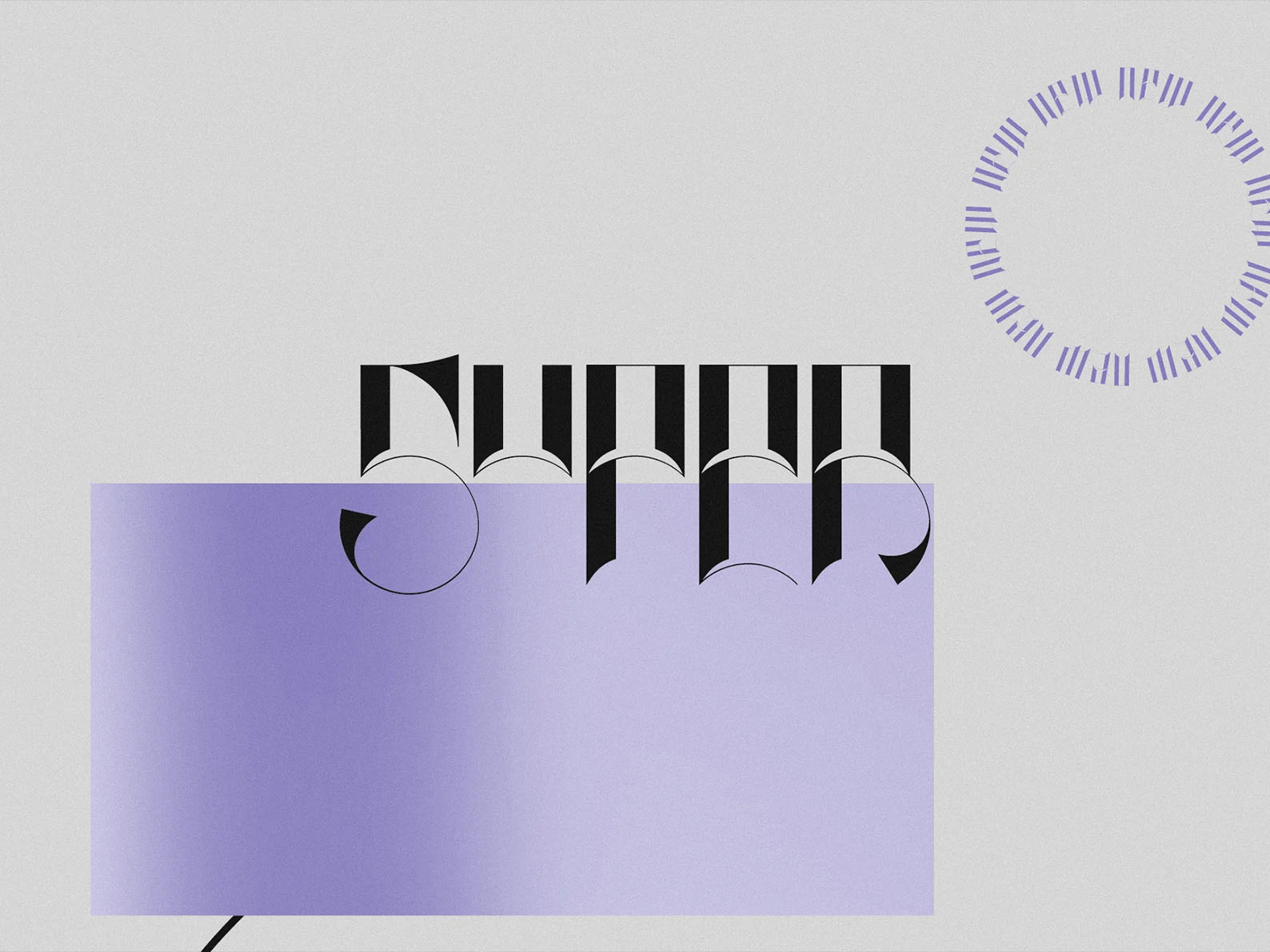
Visual Example: Notice how varying the tracking can change the texture and readability of text.
What Exactly is Tracking?
Tracking refers to the uniform adjustment of spacing between all letters in a block of text. Unlike kerning, which targets specific letter pairs for spacing adjustments, tracking is a global setting that affects the overall density and appearance of your text. Think of it as the overall "air" around your letters.
Tracking vs. Kerning: What’s the Difference?
It's common to confuse tracking and kerning, but they are distinct concepts. Tracking applies spacing adjustments evenly across an entire word, line or block of text, while kerning focuses on adjusting spacing between *specific* letter pairs that appear too close or too far apart. Kerning is more about micro-adjustments, while tracking is about the overall texture.
Why is Tracking Important?
Tracking significantly impacts the legibility and visual appeal of your text. With proper tracking, you can:
Improve Readability
Too little tracking can make text feel cramped and difficult to read. Conversely, too much tracking can make text feel loose and disjointed. Balanced tracking improves readability.
Create Visual Hierarchy
By adjusting the tracking, you can visually differentiate headings, body text, and other textual elements, creating a better visual hierarchy.
Set the Tone
The tracking applied can be a tool for shaping the feel of your message. Dense tracking can give a bold, serious feel and generous tracking can evoke airiness and elegance.
When to Adjust Tracking
Tracking isn't a "set-it-and-forget-it" setting. Here are some situations where adjusting tracking can be beneficial:
Headings and Titles
Headings often benefit from slightly tighter tracking (negative values) to appear bold and compact. It can help make the title stand out.
Body Text
For body text, you usually want a neutral or slightly increased tracking value to enhance readability, especially at smaller font sizes.
Logos and Branding
Fine-tuning tracking in logos and branding materials is crucial for achieving the desired aesthetic and brand representation. It is important to ensure the logo is legible.
Working With Different Fonts
Different typefaces have varying default spacing. Some fonts may require tracking adjustments to achieve optimal readability and visual balance.
- Serif fonts may appear more comfortable with slightly wider tracking.
- Sans-serif fonts often work well with more neutral tracking.
- Display fonts may use extreme tracking to achieve their intended effect.
Tools and Controls
Most design software, like Adobe Photoshop, Illustrator, and InDesign, allows you to adjust tracking easily. Here's a quick overview:
Design Software
- Look for the "Tracking" or "Letter-Spacing" option in the character panel.
- Tracking values are generally expressed in percentage of the base font size or as a numerical value.
- Use a value of 0 as a starting point and then adjust slightly from there.
Practical Tips for Tracking
Start with the Default
Begin by evaluating the font at its default tracking value. Often, this will work, and you can adjust from there.
Use Subtle Adjustments
Small tracking changes can have a big impact. Experiment by adjusting the tracking in small increments (e.g., 5 or 10 units at a time) to reach the desired result.
Consider Size and Length
For smaller point sizes, you generally want slightly increased tracking. For long blocks of text, adequate spacing is essential for readability. Also, for shorter lines of text you may be able to tighten tracking.
Conclusion
Mastering tracking is a crucial skill for any designer or anyone working with text. By learning how to adjust spacing between letters effectively, you can improve the readability and overall visual appeal of your designs. It's a powerful tool that, with practice, will become an indispensable part of your typographic toolkit.