Decoding YouTube's Typography: What Font Does YouTube Use?
A Look at the Font Choices Behind the World's Leading Video Platform
Ever wondered what font does YouTube use? The answer involves several key typefaces that contribute to the platform's recognizable look. While Roboto serves as the primary font, YouTube also utilizes a custom typeface, 'YouTube Sans', and its iconic logo uses 'Trade Gothic'. This article delves into the specific fonts YouTube uses, their purpose, and why they are essential to the platform's design.
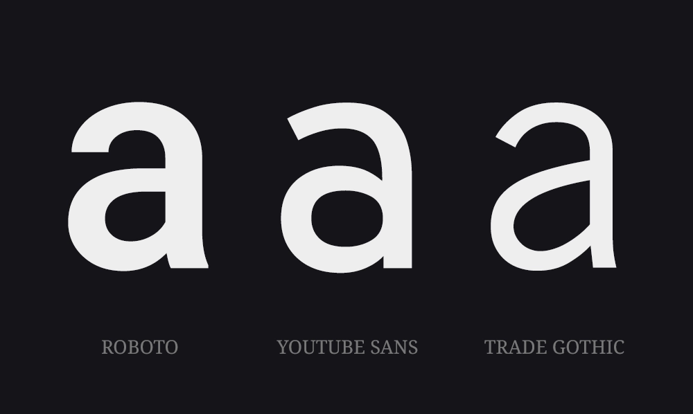
A visual representation of the three distinctive fonts featured on YouTube.
The Primary UI Font: Roboto
The main font that YouTube employs is Roboto. This versatile sans-serif typeface, designed by Christian Robertson for Google, is used across the platform for its excellent legibility and adaptability. You'll find it in video titles, descriptions, user interface elements, and comments. The consistent use of Roboto across YouTube is a critical aspect of what font does YouTube use, and it helps maintain a cohesive and intuitive user experience.
Why Roboto?
Roboto was carefully chosen by Google for its clarity and adaptability across various screens and resolutions. Its geometric construction and open forms make it readable on all devices from desktop to mobile. This ensures a consistent viewing experience for all users globally. The neutrality of Roboto also allows it to complement the varied content on YouTube without being distracting.
Roboto's Role in User Experience
Roboto’s clean design ensures the text is easily scannable, allowing users to quickly navigate video titles, channel names, and other essential information. This readability is paramount to engagement and content consumption on the platform. The focus on what font does YouTube use is to provide easy access to all information.
Accessibility Considerations
The choice of a highly readable font like Roboto is crucial for accessibility. Roboto ensures users of all abilities can comfortably navigate the website and access all video content. This focus on readability and design is central to the inclusive values that YouTube strives for.
Font Consistency Across Devices
Roboto’s consistent rendering across all devices is vital. Regardless of whether you’re using a desktop, tablet, or mobile device, the typography remains uniform and legible. This promotes a seamless and consistent user experience and strengthens brand recognition. Understanding what font does YouTube use, shows its focus on consistency.
Introducing 'YouTube Sans'
In addition to Roboto, YouTube also employs a custom typeface known as 'YouTube Sans'. This font is a variation on the general font family and is used in specific areas, such as headers and marketing materials. The custom font helps to reinforce brand identity, providing additional visual recognition within the platform's design language. While not as pervasive as Roboto, YouTube Sans serves a key purpose in brand expression.
How 'YouTube Sans' Differs
YouTube Sans is built specifically for the brand. It's a modified, distinct, and contemporary font that is slightly different to Roboto. It's designed to be slightly more bold and striking, allowing key design elements to stand out when required. It’s a more expressive option than the usual Roboto typeface. These key elements further define what font does YouTube use.
The Logo: Trade Gothic
While Roboto and YouTube Sans are used for the interface and promotional content, it's important to note that the YouTube logo itself uses the typeface 'Trade Gothic'. This bold sans-serif font gives the logo its distinctive and recognizable look. The use of a distinct typeface in the logo is strategic, solidifying YouTube’s brand recognition. Trade Gothic provides a strong and memorable brand image, which contrasts with the more functional role of Roboto in the interface.
Roboto in YouTube's Design System
Roboto is integrated into YouTube’s Material Design system. The design system ensures consistent and user-friendly interfaces. YouTube utilizes these guidelines to ensure all text is always readable and accessible.
The Evolution of YouTube's Typography
YouTube's design, including its typography, has evolved over time to meet user demands. The consistent usage of Roboto alongside custom solutions like YouTube Sans demonstrates a focus on creating a user-friendly and engaging experience. Understanding what font does YouTube use shows this commitment to clarity and design.
Impact of Typography on User Engagement
The typography on YouTube enhances the user interface, aiding easy navigation. Legible text keeps users engaged for longer, allowing them to consume video titles, descriptions, and comments more easily. The overall design choice enhances the user's overall experience on the platform.
Typography and the Brand Identity
The selection of Roboto, YouTube Sans, and Trade Gothic helps to reinforce the overall brand identity for YouTube. Each font has a purpose and helps to elevate the brand. Typography has a large role in brand recognition for a platform as large as YouTube.
Conclusion: The Power of Typography
The choice of Roboto as the main interface font along with the inclusion of YouTube Sans and Trade Gothic for the logo helps to create the user friendly and recognisable YouTube we know. Understanding what font does YouTube use highlights the importance of strategic typographic design decisions, impacting user experience, readability, and overall brand recognition.

